Signage for the CoCo Floral Couture Boutique
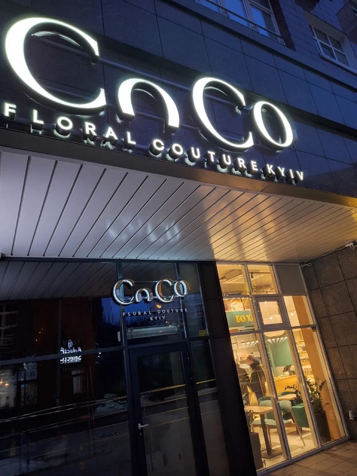
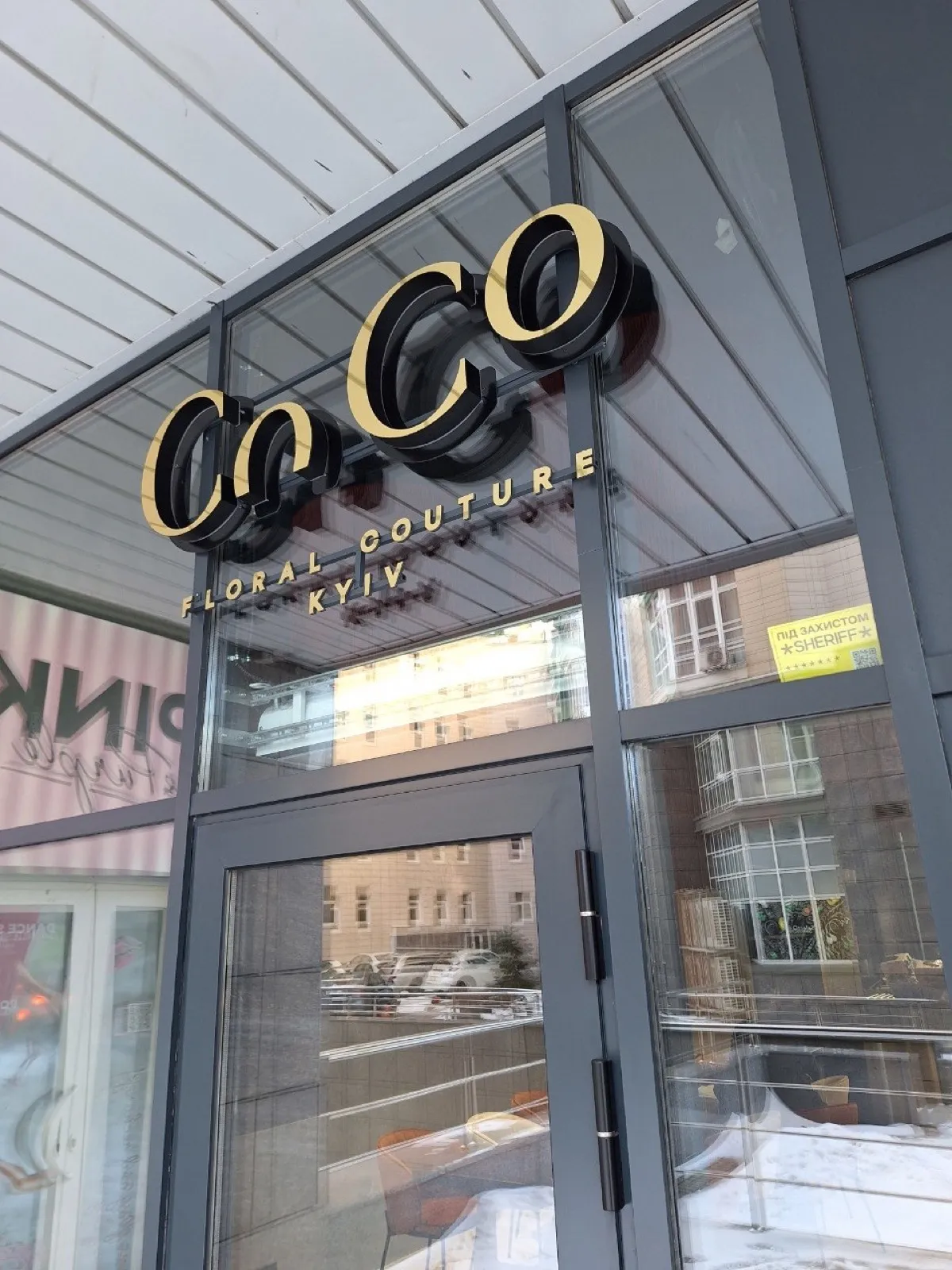
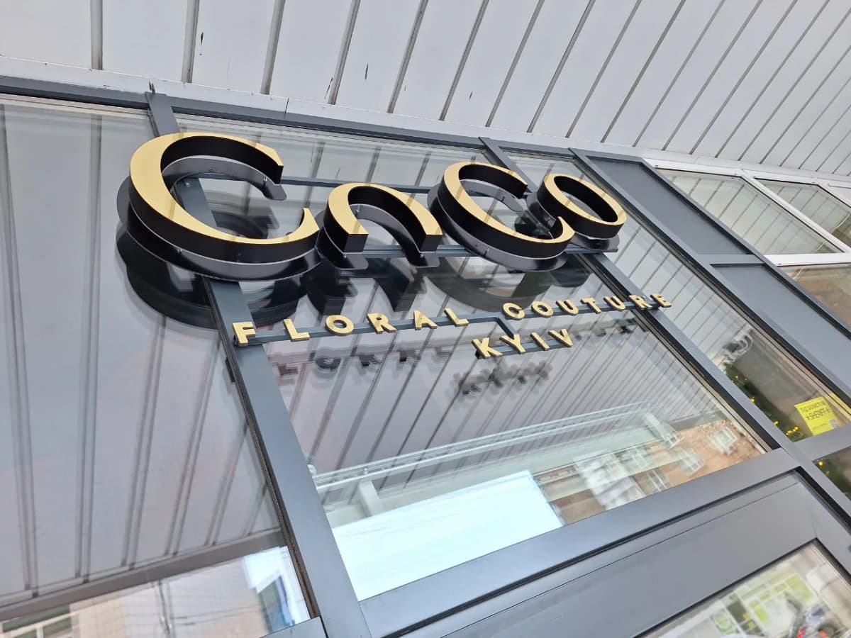
One boutique, three sets of letters: halo-lit above the canopy, gold straight onto the glass, mirror-faced inside. One typeface throughout; only the face material and the size change.
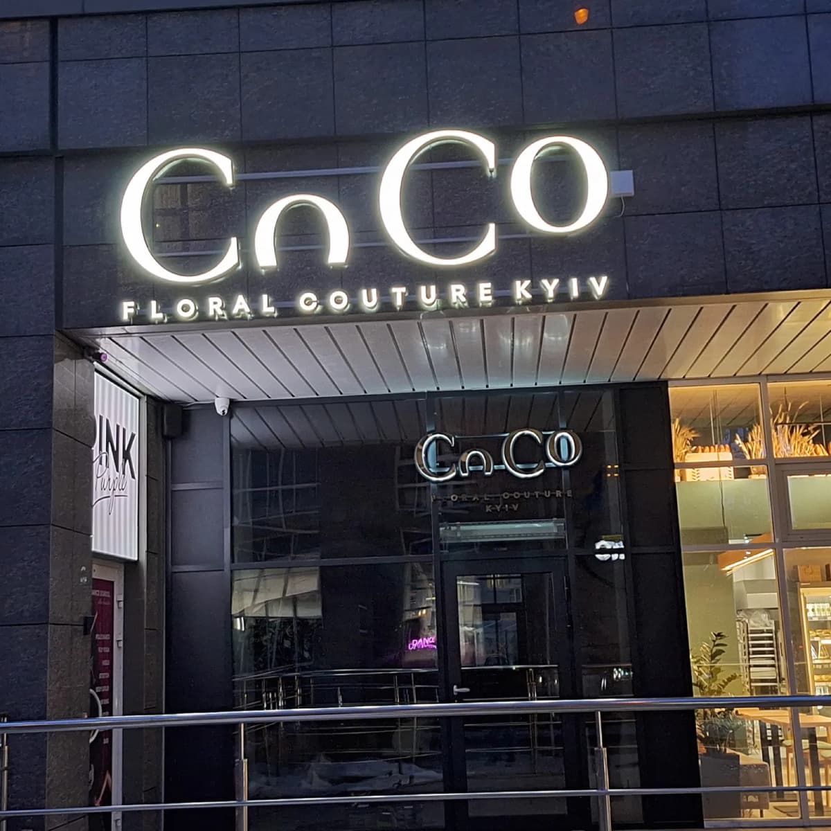
The boutique occupies a corner unit in a building with a tall ground floor. The entrance is set deep under a canopy, so a single sign cannot cover both viewing distances.
The upper set is halo-lit CoCo lettering with "floral couture kyiv" beneath it, mounted above the canopy. That is the long shot — visible from the opposite pavement and from a car. The lower set is smaller and gold, fixed straight onto the canopy glass, and it is read by someone who has already walked up and is looking for the door.
Both sets use one typeface and the same proportion between name and strapline. Only the face material and the size differ. That is deliberate: when the upper and lower signs use different type, an entrance starts to look like the tenant took over from someone else and never finished swapping things out.
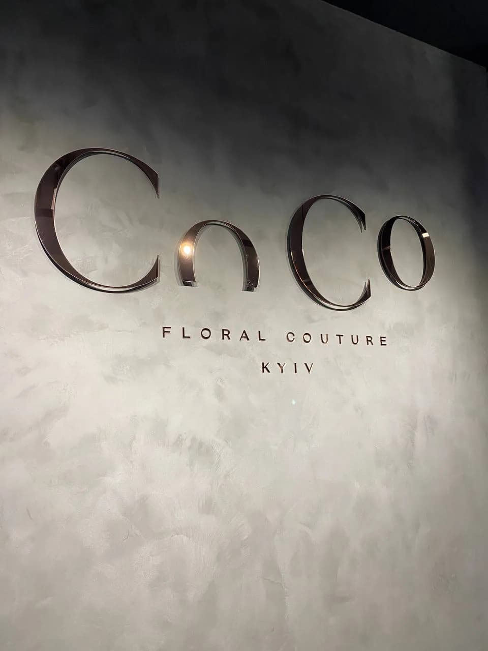
A third set stands inside — mirror-faced letters on a pale wall, unlit. In a room lit by spots, polished metal gathers light on its own, and LEDs would only have doubled the reflections. Same typeface as the facade; only the face material and the size changed.
Services in this project