Sign for the Felicità Food Market
Two structures in one sign: a script name in 3D letters, and an oval lightbox underneath that explains what kind of shop this actually is.
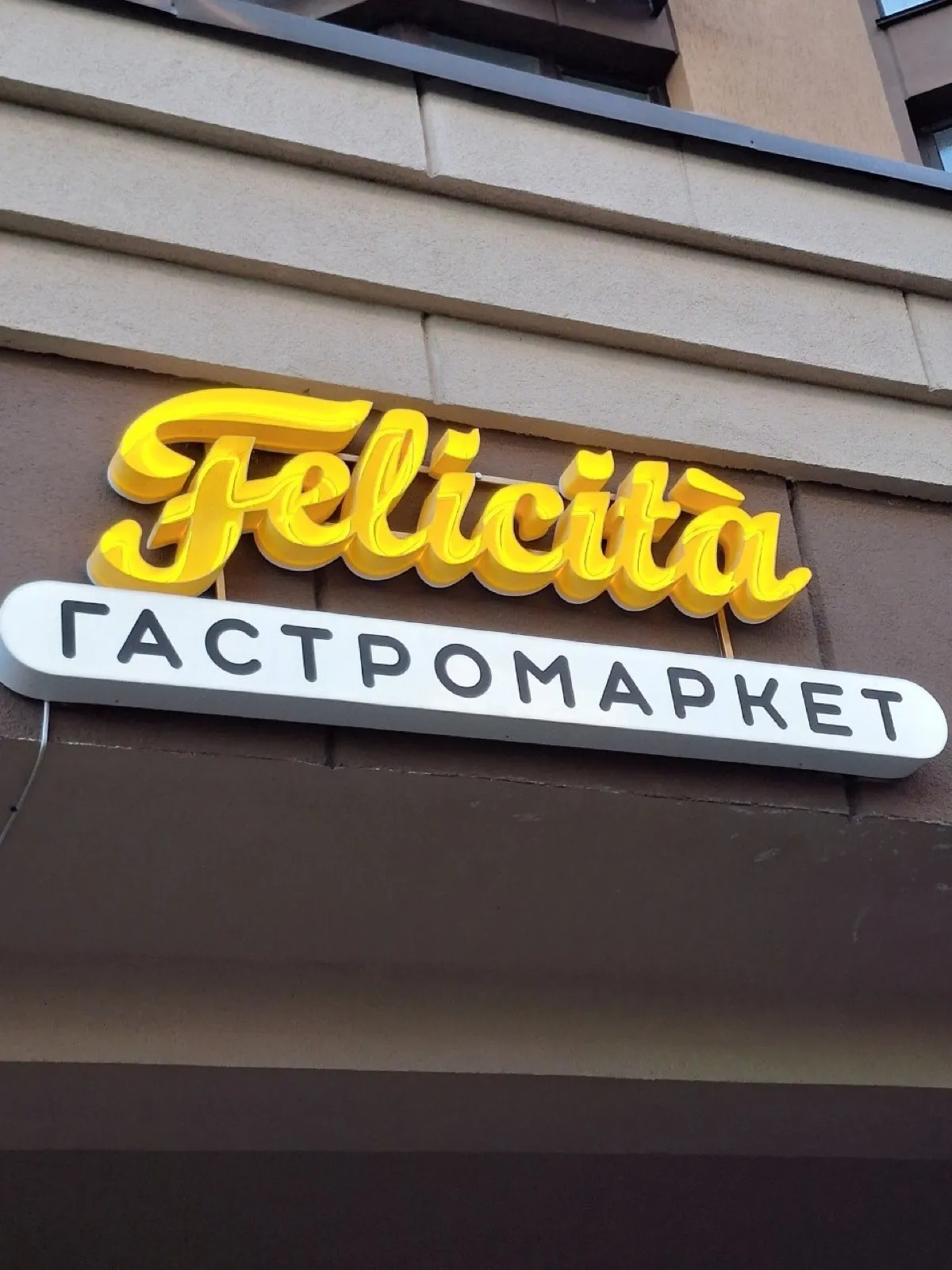
The name is set in a script with tall ascenders and descenders, which is the most awkward kind of typeface for 3D letters. The thin joins between characters have to be made as one continuous part, or the whole thing falls apart into separate pieces that can never be aligned on the wall.
So Felicità was built as a single element: the entire word cut with its joins intact, painted yellow and mounted on a concealed frame. The dot over the i and the accent over the a are separate parts, set on the same axis and at the same height.
Under the name sits a white oval lightbox carrying the words for "food market". It does two jobs: it explains the format to anyone who does not know the brand, and it gives the yellow script a bright backdrop that keeps it legible on a grey day. The oval follows the slope of the script line, which holds two very different elements together.
Services in this project