Two Signs on One Wall: Je t’aime and fastline studio
A cosmetology clinic on top, a studio below, one frame for both. To stop the two signs cancelling each other out, they were separated by type of light: one lit through its faces, the other with its colour gathered into a single lightbox.
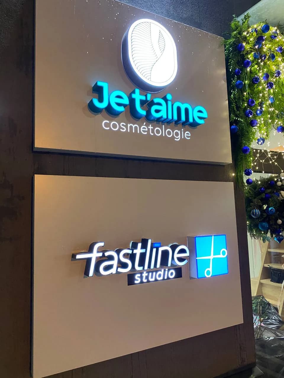
Two panels in a shared frame, one above the other: a cosmetology clinic on top, a studio below. The situation is familiar wherever one entrance serves two businesses. So is the temptation — to make your own sign brighter than the neighbour’s. Give in to it and both lose: the wall becomes a contest of brightness and the passer-by finishes reading neither sign.
So the two marks were separated by type of light, and brightness was left out of it. On Je t’aime the letter faces are coloured and lit through, while the logo above works the other way round — the disc stays dark and the light comes from behind its edge. On fastline the pairing is reversed: white letters with dark returns, and the colour gathered into a single patch, a square lightbox with the mark cut out of it. That leaves one turquoise accent at the top and one at the bottom, and they do not argue.
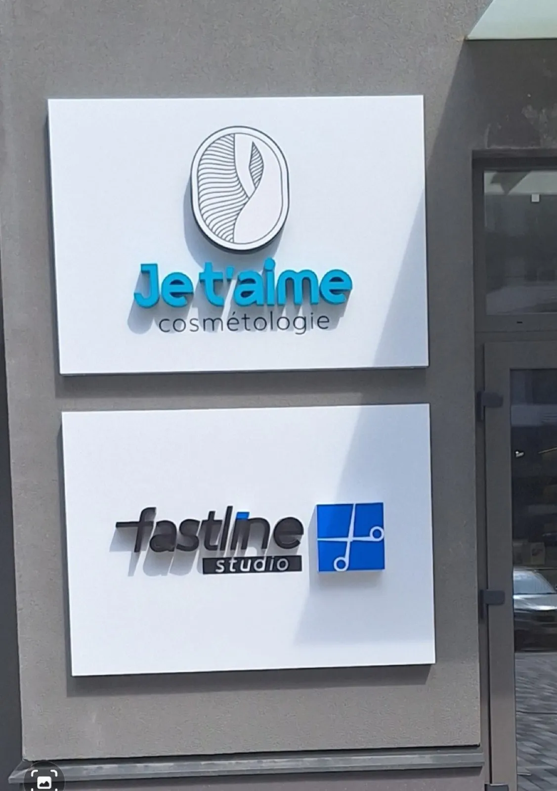
The other half of the job is the daytime state. In daylight the lighting does nothing at all, and the wall is read as geometry: the field of the panel, the margins, how much air was left around the lettering. So both panels share a texture and hold the same margins — and the difference in size between the two marks then looks deliberate.
Any sign with a switch has to be designed in both states. A composition built only for the night photograph falls apart by day.
Services in this project