Kyiv Capitals: Dimensional Letters and an Acrylic Plate
One word became dimensional letters, the other an application on a clear plate. The reason is simple: the second word is half the cap height, and a small dimensional letter both holds worse and takes longer to line up.
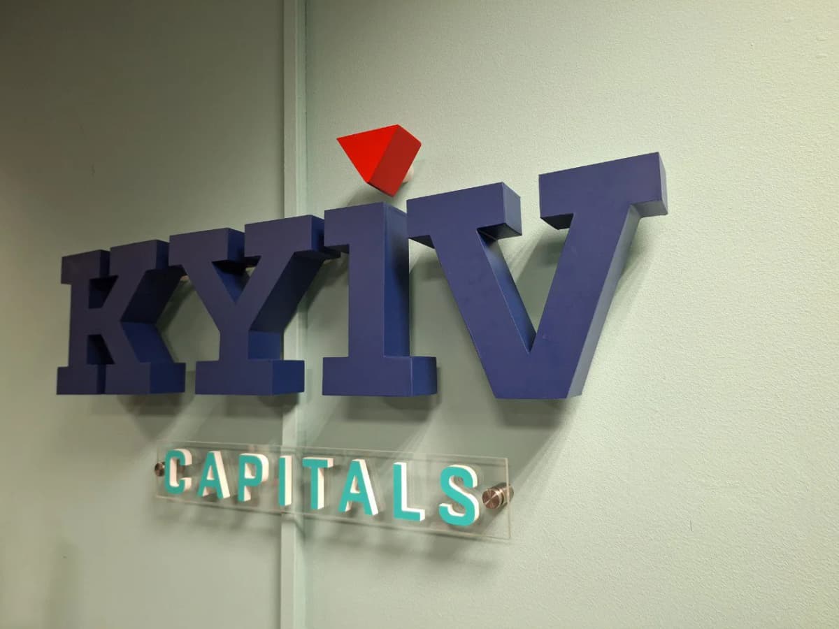
The sign is built in two parts, and they are made differently for a reason. KYIV is a set of individual dimensional letters fixed straight to the wall. CAPITALS is half the cap height, and at that size a separate letter becomes a problem: it has a small bearing area, it takes longer to line up, and it is easier to catch with a hand or a vacuum cleaner.
So the second word moved onto a clear acrylic plate. The plate holds the letter spacing exactly as the artwork set it: one rectangle gets levelled on the wall instead of eight characters. Standoffs carry it a few centimetres off the surface — and that gap is what makes clear acrylic visible at all: a shadow falls behind the plate, and without it the plate simply disappears against a pale wall.
The KYIV letters are painted a deep blue with a generous return. A dark dimensional letter on a pale wall needs no illumination: the paint supplies contrast and the room's raking light supplies the form. The photo shows it plainly — every character throws its own shadow to the right, and the line reads as relief rather than as a sticker. The usual mistake runs the other way: an illuminated letter on a pale wall is washed out by its own light and the shape dissolves.
The red pyramid above the I stands proud on its own spacer — the only element not in the plane of the letters. That small saturated accent above the line carries the whole composition; without it, two words in one shade of blue would read as a notice rather than as a mark.
Services in this project