Makariv Lyceum No. 1: Letters on a Sloping Canopy
The canopy band slopes, so the line of type was set parallel to it rather than to a level: squared to the horizon, the gap above the letters would have turned into a wedge.
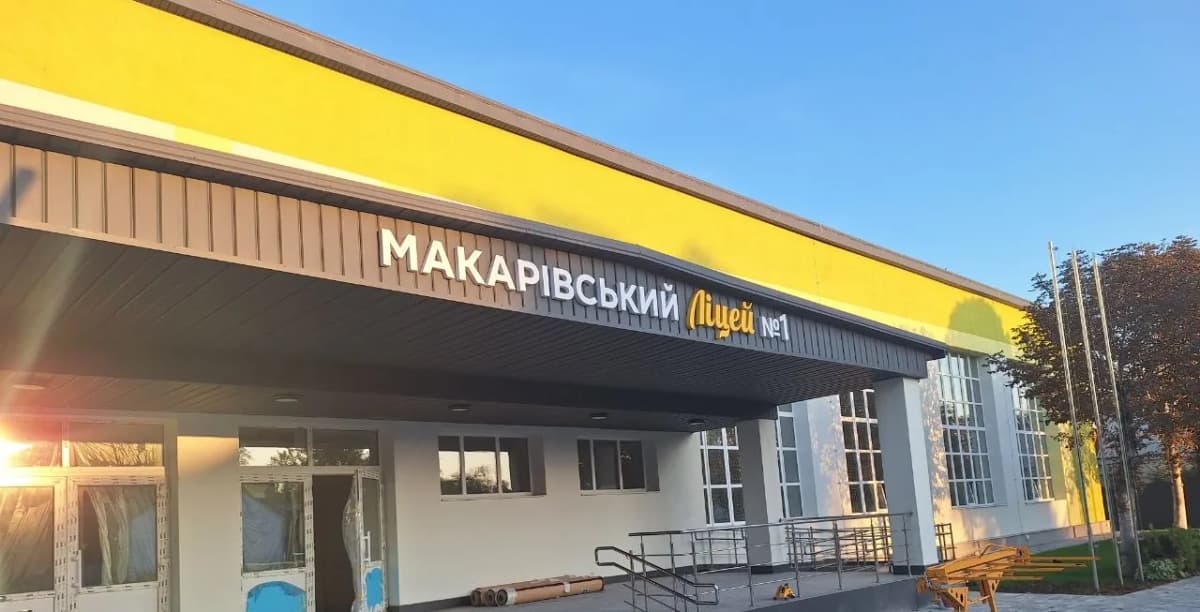
There is one place for a sign here: the sloping fascia of the canopy over the entrance, clad in dark profiled metal. There is no horizontal in it: the band follows the pitch of the roof. So the line of type was set parallel to the band and not to a level. Squared to the horizon, the gap above the letters would have turned into a wedge, and the sign would have looked like it had slipped while hanging dead straight.
The profile adds a second condition. It is not a flat plane: a letter lands on the crests, with air between them. Fixings go where the metal is and the rest of the footprint bridges the trough. A wide letter has several crests under it; a narrow one may not catch a single convenient one, which is why the setting out is done on the ground rather than up on the fascia.
The lockup uses two typefaces. The town’s name is an upright grotesque in caps, the word for lyceum below it a brush script. The script is the harder half to make. A written letter has hairline passages, and a dimensional letter needs enough width to physically take a return, so wherever the pen thins out you negotiate with the drawing. And although the line reads as continuous, every character is a separate part. The spacing is carried to the wall on a template, or the joins between letters drift apart.
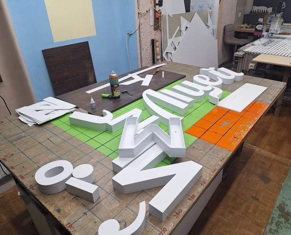
In the workshop photo every letter is still white. Faces are cut on the flatbed router, returns are cut into strips and glued around the contour: contact spray, then a drop of superglue to hold it while it sets. Colour goes on later and only on the face. That is why the script word on the facade is yellow: it picks up the yellow band of the building itself, while its returns stay white.
There is no light in the letters and none is needed. It is shade under the canopy all day, and shade is a question of contrast rather than brightness: white on graphite is legible from the road without a single watt.
Services in this project