Signage for Sport Life Gyms
One club got the name running vertically up a red column, another a colour-lit set behind glass across two storeys, a third halo-lit letters on stone inside a mall. The format is dictated not by taste but by where the sign is seen from.
Gym customers arrive by car and decide at speed. So the signs go high: at eye level they are lost behind parked cars and trees.
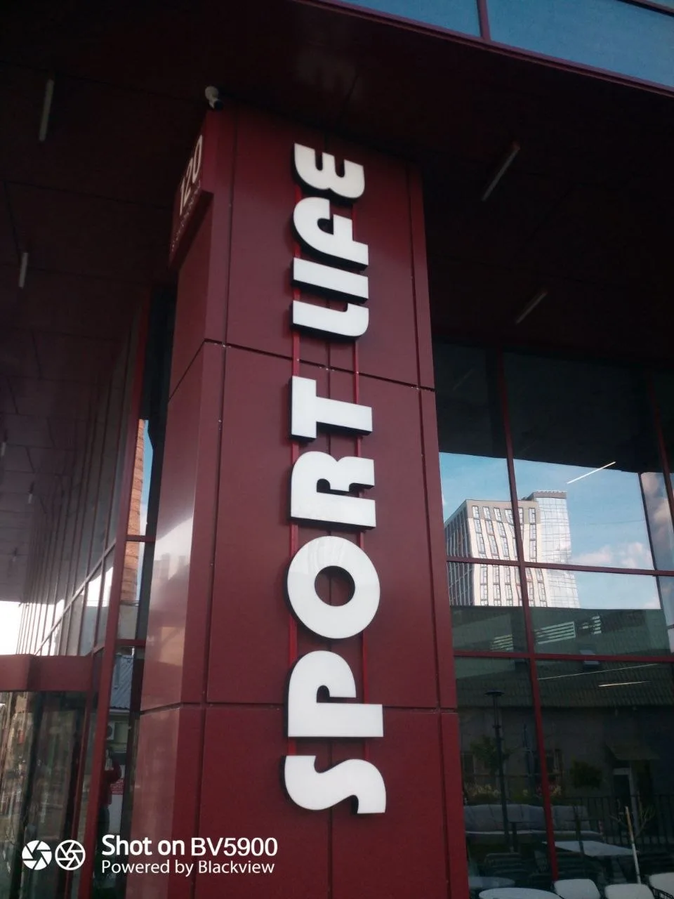
On one site the name runs vertically up a red column that already projects from the facade. Vertical setting reads worse than horizontal, but the column is visible from both directions of traffic, and that advantage outweighs the awkwardness. The letters are white and dimensional with no illumination — the red field behind them is contrasty enough by day, and floodlights on the canopy pick it up at night.
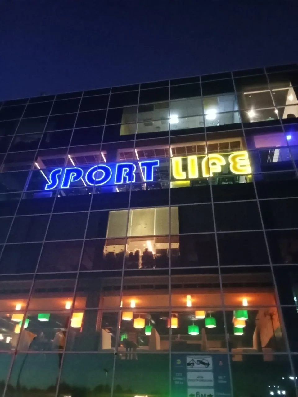
The second site is a glazed facade, where signage is fixed to a structure behind the glass. Here it went in colour: each word has its own hue, and in the evening the name reads as a band of light across two storeys. Working at that height is its own job — every fixing is calculated for wind load and lever length, because taking a structure down and reworking it up there costs more than building it twice.
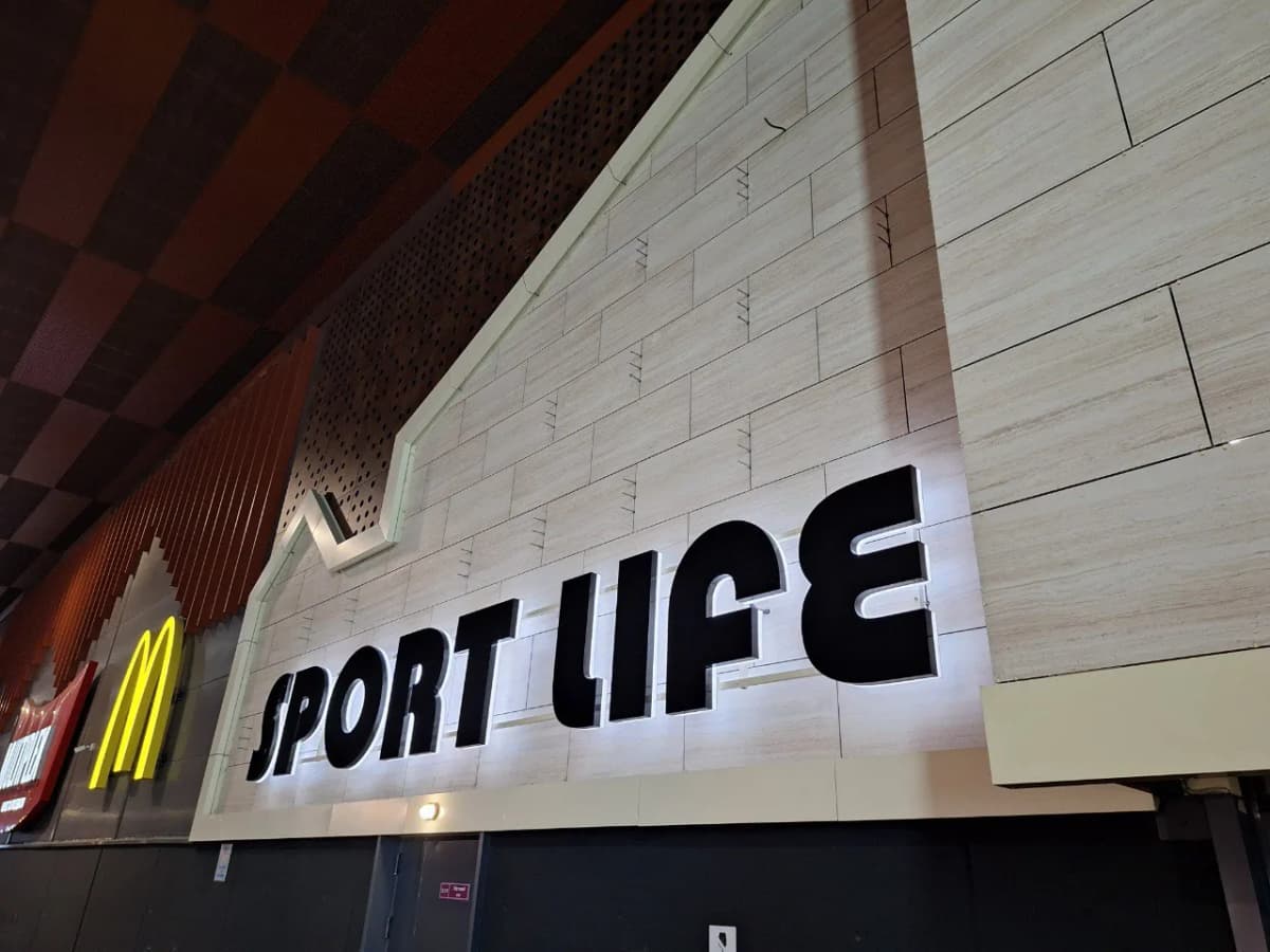
The third format is inside a shopping centre. There is no road and no speed there: people pass on foot a few metres away, and halo lighting starts doing the work that brightness does outdoors. The letters are black with the light thrown behind them, so a soft glow sits around each character on the pale stone. The wall is clad in slabs, so the fixings are set out along the joints — drilling into a slab near its edge means a crack, and a crack there is visible from anywhere in the gallery.
Services in this project