Sign and Window Graphics for the YABLUKA Electronics Store
The real competition here comes from inside. The lit posters and the screens behind them are brighter than any quiet sign above the door, so the letters were made large, pale and front-lit. The fitting was done overnight.
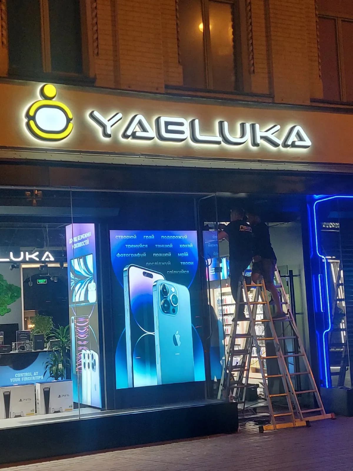
The hard part of this facade is the competition from inside. The windows hold backlit phone posters with screens behind them, and any quiet sign above that entrance reads as a dark strip.
The letters were made large, pale and front-lit, with the apple logo set ahead of the name as its own block. The returns are shallower than usual for lettering that size: deep letters above an entrance throw a long shadow onto the canopy and visually press the whole entrance down.
Installation ran overnight, after the retail passage closed. That is standard for shops in busy locations — there is nowhere to stand a ladder during the day, and no owner wants customers walking around fitters. The store opened the next morning with the sign in place.
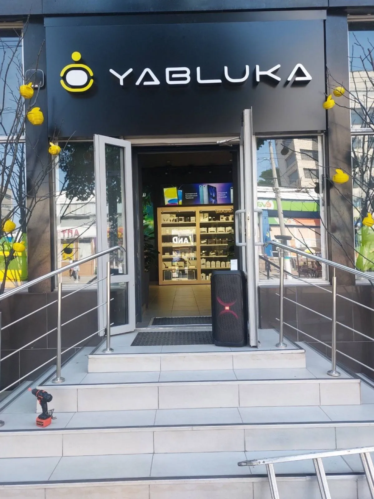
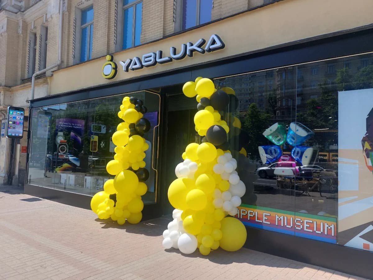
By day the facade behaves differently. The lit posters in the windows are no longer the brightest thing there, but sun and reflections in the glass arrive instead, and the sign is left as the only matt surface across the whole frontage. That is why the face was kept pale and uncoloured: a coloured name over a window like this would compete with the advertising inside, whereas a pale grey one holds its band in any light.
Services in this project