An ŌNE Sushi Lightbox on a Panel of Light
The entrance sits in the shade of a balcony, so the light comes in two stages: a wide white panel lifts the general level under the soffit, and the blue box with the name stands proud of it and does the naming.
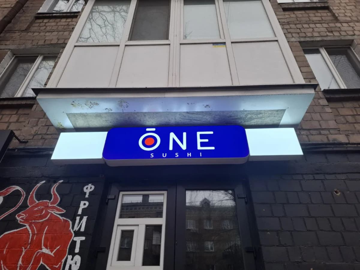
This entrance sits in shade. A glazed balcony overhangs it, its underside grey and streaked, and any single sign under a soffit like that reads as a dark patch in a dark recess. You cannot repaint somebody else's balcony, so the entrance has to be pulled out with light alone.
Hence the two-part build. A long white panel with no graphics at all runs the full width of the opening — it names nothing, it simply raises the light level under the soffit and gives the entrance an edge again. The blue box with the name is smaller, set proud of the panel and centred on it: against a bright field it needs to be neither large nor especially intense to be read first.
A two-colour lightbox face is built by application over opal acrylic: the field is tinted, the characters left clear, so at night the letters glow white and the field glows blue. Inverting that — white field, blue letters — would lose here: a large pale board at first-floor level glares and eats its own name. The red dot inside the Ō stays saturated after dark too, because dense film passes less light, and the dot keeps reading as a mark rather than as a hole in the field.
The name is short: three characters and a strapline beneath. That is rare and it pays — the box comes out small, with softly rounded corners, and stays clear of the balcony. A longer word at the same width would need a narrower typeface, and a narrow character lights worse inside a lightbox: less room is left between the face and the return, and a dark frame appears around the contour.
Services in this project