Lettering on the Orange Facade of Toloka Maison
Matte black letters with a deep return and no illumination: against bright orange the contrast is already at its maximum, and the ground-floor window light picks the name up at night.
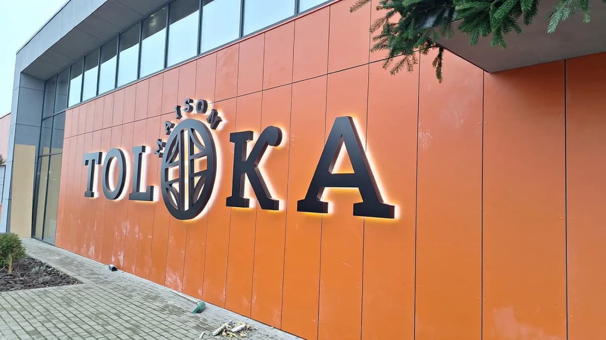
The building had just been reclad in orange composite — twenty-odd metres of unbroken surface, no windows, no divisions. There is nothing on a wall like that for a sign to relate to, so the letter height was worked out from the viewing distance to the road, not from the width of the facade.
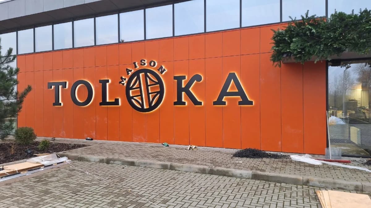
The letters are matte black with a deep return. Against bright orange the contrast is already at its maximum, so no illumination was added: by day the colour carries the name, and in the evening the ground-floor window light picks it up. The globe logo was built into the word in place of the letter O, which kept the whole thing on one line instead of eating another half of the wall.
Installation was set out with a level. On composite cladding, half a degree of tilt is visible from the road, because the panel joints run dead horizontal and act as a ruler.
Services in this project