Signage for the viyar Furniture Showroom Chain
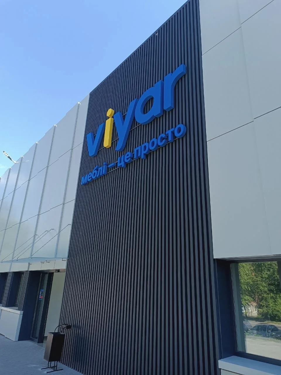
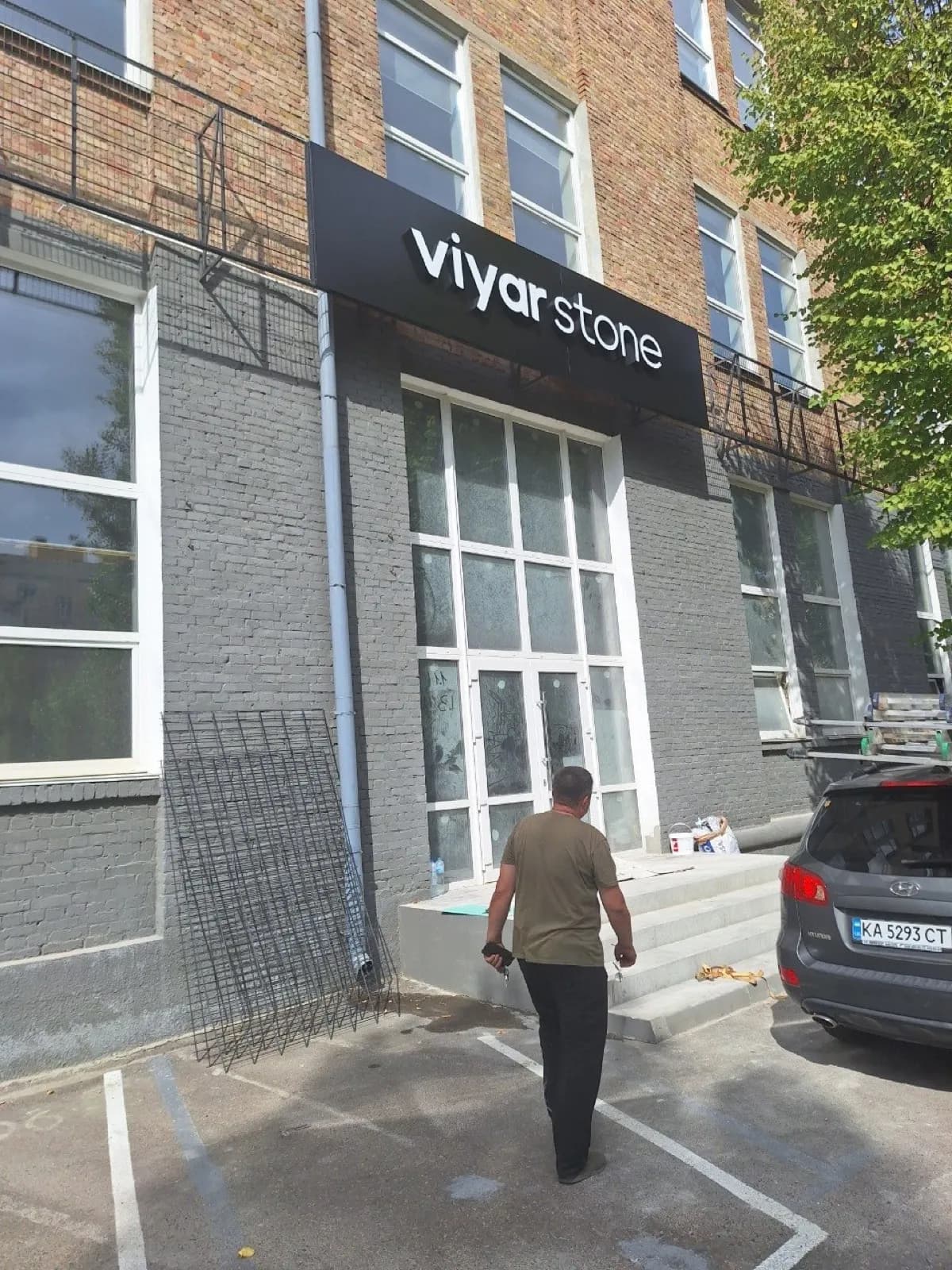
One name, four buildings, three different wall colours: dark seam-clad metal, a hundred metres of pale render, brick. The size was recalculated every time; the proportion of logo to strapline never changed.

A furniture chain inherits whatever facades it gets: dark seam-clad metal on one site, a hundred metres of pale render on the next, brick on the third. The size had to be recalculated each time, but the internal logic of the block stayed fixed.
The block is the logo with the strapline beneath it. The proportion between them is the same on every site: the strapline is exactly half the height and aligned to the left edge of the name. That ratio is what makes the showrooms recognisable: people remember the proportion, not the centimetres.
Colour was decided facade by facade. On dark metal, blue with a yellow dot reads with no backing panel. On the long pale frontage the same name had to grow and thicken slightly, because a bright field eats fine detail at distance. The separate viyar stone line got its own mark in the same typeface so it would not look borrowed next to the main sign.

Services in this project