A Red Fish and White Letters: the UOJI SUSHI Sign
Two blocks of different natures on one line: a solid red shape with the name cut straight through it, and a row of white dimensional letters. The hard part is aligning a shape that has no baseline.
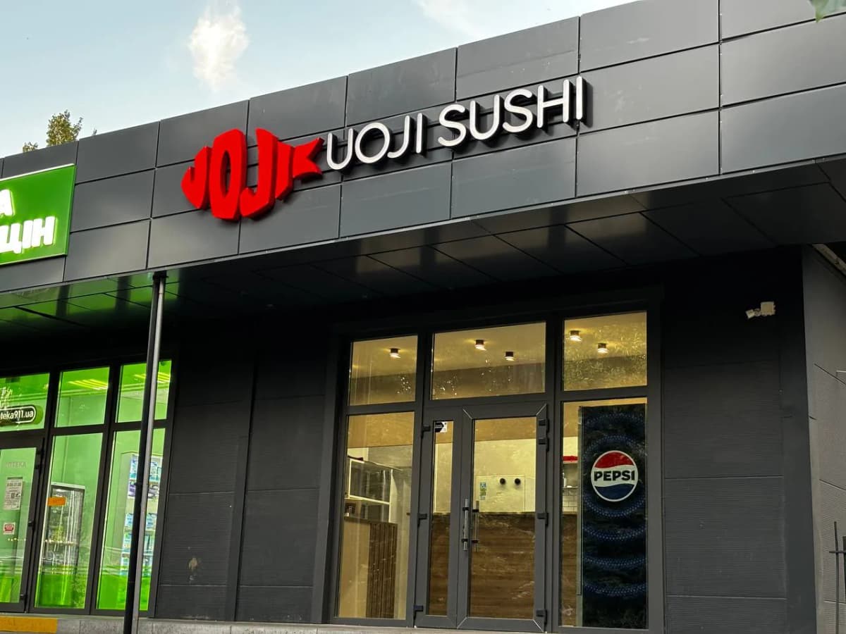
There are two blocks on this facade and they are made differently. The logo is a solid red fish shape with the name not applied on top but cut clean through it: the same grey cassette that surrounds the sign shows through the characters. That keeps the shape a single body rather than a scatter of parts, but it also changes the cost of a mistake — a cut contour cannot be nudged later, whereas an applied letter can be refitted.
The second block is a row of white dimensional letters. Aligning them to each other is easy; aligning them to the fish is not. The shape has no baseline, so it is set by optical weight rather than by geometric centre. The tail runs into the first character of the name as well, the gap between them is minimal, and any drift in height shows at first glance.
The facade is composite cladding, and that dictates the fixings. A cassette face carries no load: the studs go through to the sub-frame behind it, otherwise a dimple forms around every point over time — and in raking light that dimple reads better than the sign does. The fixing pitch has to follow the cassette layout rather than the letter layout, so the setting out is done on the facade, not on the drawing.
The whole sign runs to three colours: a dark grey field, a white name, one red accent. Had the fish been the same size as the line of type, the two would compete; it is smaller but it is the only colour, so the eye takes it first and moves straight on to the text. On a dark facade that is the entire mechanism of daytime legibility — area and contrast, with no further trick involved.
Services in this project